Issues and Potential Confusion
Font Size and Measurement Confusion
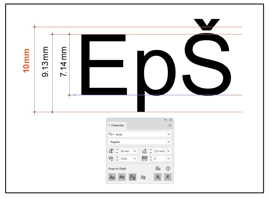
Most users believe that if they set a font size of 10 millimeters on their computer, that is exactly how it will appear when printed. However, that is not the case. Different fonts vary in actual physical size even when the same point size is selected. Moreover, the specified font size is not directly related to the height of uppercase letters such as “A” or “E”.
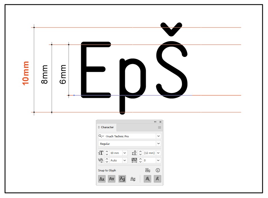
For instance, when a font size of 10mm is set using Arial, the printed letter “A” will measure 7.1mm in height. In contrast, with Orach Technic Pro, the same letter will measure 6mm.
In graphic design software, this is rarely a problem. Designers are accustomed to using point sizes and visually understanding what size 10pt or 12pt means on the printed page. Their eyes are trained to interpret these sizes. However, for mechanical engineers and machinists, this inconsistency can pose a serious problem. In engraving or CNC programs, specifying a font height of 10mm refers strictly to the actual height of the uppercase “A”—there is no ambiguity in engineering practice.
The problem in real-world use arises when machinists are unaware that the 10mm font size in a graphics program does not result in a 10mm-tall letter, and when graphic designers are unaware that font size in mechanical contexts is absolute and literal. Of course, there are exceptions—some professionals from both fields are aware of this discrepancy—but in my 40 years of working with both sides, I’ve rarely encountered someone who fully understands both systems.
Countless times, I’ve received a carefully dimensioned plate drawing from a mechanical engineer in CAD, complete with annotated font sizes (e.g., 5mm tall text). Upon printing, the plate’s dimensions are correct, and the text appears visually aligned. However, when measured with a ruler, the letters are only 3.6mm tall, not 5mm as labeled. This discrepancy leads to frustration: “I asked for 5mm-high letters, but you delivered 3.6mm.” If I had printed the letters at 5mm in height, they would not have fit within the design constraints. I then have to explain to the engineer why this happened—something they typically weren’t aware of.
I don’t blame either group; I simply highlight the significant divide between the technical and graphic worlds, and how font measurement remains one of the core points of confusion.
I recall a world-renowned typographer and university professor once telling me he had never in his life seen an engraving or CNC machine actually engrave letters—and he was already retired. Likewise, many mechanical engineers have never stepped into a print shop, let alone know what Nonpareil or Petite sizes mean in typography.
That’s perfectly fine—they are entirely different worlds. This is precisely why, in the 1990s, we created the first versions of the Orach Technic .ttf font, which rendered text on a 1:1 basis—meaning the height of the uppercase “E” exactly matched the specified font size. At the time, this was a breakthrough: no other font worked this way. However, in graphic software, it appeared around 30% larger than other fonts of the same size, leading people to think the font was broken. We eventually had to adjust the font to conform to graphic design conventions, though we kept it slightly smaller than Arial and other fonts for better practicality.
Today, you can safely assume that letters rendered using Orach Technic Pro will be about 60% of the specified size. So, if you need a 10mm-high “A”, you would input 6mm. Other fonts do not follow this rule. This slight reduction in scale also helps when used in AutoCAD, where Orach Technic is primarily intended for technical use. When switching a dimensioning style to Orach Technic Pro – Light (ProCAD), all annotations appear slightly smaller and more discrete than other fonts at the same input size—ensuring that the technical drawing takes visual priority, with the dimensions remaining subtle yet legible.
Another reason for making Orach Technic Pro slightly smaller is to ensure that when it replaces any other text or numbers within a table or form, the content remains within the original boundaries. If needed, the font size can be slightly increased without exceeding layout limits.
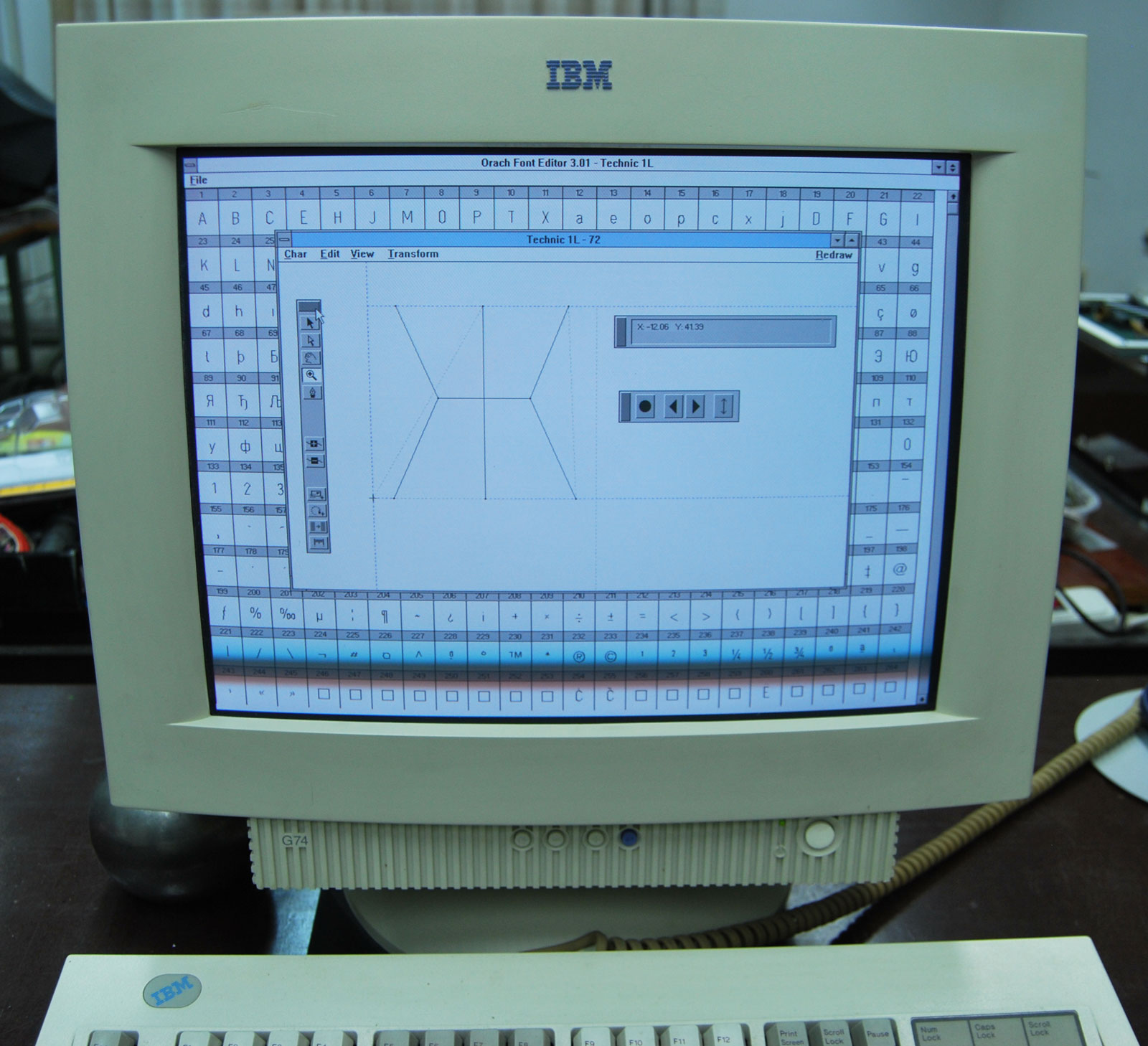
Our engraving-specific font format, .eff (engraving font format), was developed especially for use with our Orach Engrav software. In this format, the letter “A” (or more practically, “E”) is rendered exactly at the specified height. In the 1990s, we offered this format as an open standard to various engraving machine manufacturers, but none accepted it. Each vendor preferred to sell proprietary fonts compatible only with their machines. We never planned to commercialize the Orach Engrav program or its font editor—it was developed solely for our internal use.
My passion for both graphic and mechanical software has remained equally strong over the years, much like my admiration for the design of a Ferrari and its beautifully engineered engine. What has always frustrated me about the two most dominant software tools in these fields (I won’t name them) is their practical incompatibility—even though on paper, they appear interoperable. I once wrote an article comparing them to two alpha bears in a forest: when they meet, all others scatter. They may pass each other without conflict, but true cooperation is out of the question.
Nobody writes about these issues online, simply because very few people are affected by them. And yet, a better collaboration between these two dominant tools is something humanity could truly benefit from.
A Note on Numbers:
There is also an ongoing debate regarding numeric characters. In many graphic fonts, numbers are intentionally designed to be slightly smaller than uppercase letters for aesthetic reasons. However, in technical fonts intended for CNC use, the numbers must be the exact same height as the letters.
Additionally, there are two basic methods of designing numeric characters. The first creates a visually pleasing number sequence with varied widths and white space per character. The second is optimized for tabular data: the digits are uniformly spaced with equal side bearings, ensuring perfect alignment in tables. However, such digits may appear awkward when used in continuous numeric text.
For this reason, Orach Technic Pro includes two sets of numerals. The default set (with variable spacing) is used during normal keyboard input. The second set (tabular-aligned) is accessible via insert character commands, allowing individual numbers to be placed precisely where needed.
Character Arrangement in a Font
This has already been described in the section "Why arrangement of the letters in the font not like Unicode list".
What I would like to add here is the following:
As already explained, everything a mechanical engineer or designer typically needs is located in the first half of the font, and these elements are easy to find. The less frequently used characters are placed in the second half of the font, where confusion is possible — and this distinction is important to understand.
Among the 820 mathematical symbols, virtually everything defined by Unicode is included in this second section of the font. However, if someone searches directly within this group for one of the 16 basic mathematical symbols, they wont find them there — because those symbols are actually located in the first part of the font. This may lead to the mistaken impression that those characters are missing from the font. Thats why its important to understand Why they are not located in that part. Why Was It Necessary to Include All These Characters in a Technical Font?
In most cases, such an extensive set of characters is not strictly required in a technical font.
So, what was the reason for including them all?
Over the many years I spent developing this font, I often received feedback—more precisely, criticism—from typographers and colleagues in the font design community. They claimed I was unnecessarily "cramming" extra letters into the font just to boast a larger character set than theirs. This couldn’t be further from the truth. They refused to accept my explanation simply because they never encountered the problems I did. Unlike me, they were not involved in mechanical engineering, industrial design, architecture, or the multilingual challenges these fields impose on typefaces.
Let me explain why all these characters were not only necessary for me personally, but also likely essential to many others in the industry.
Working in a design or construction firm doesn’t just involve creating original documentation—it also means opening and working with countless external files, which often contain unfamiliar symbols or fonts. Many of these files come from various sources, including the internet. That’s the root of the need for this extended character set.
In my long career working with engineers, architects, and designers, I’ve collaborated with more than 3,500 companies. I’ve received all kinds of files for engraving labels, designing tools, or other specific tasks. It was always frustrating to open a file and see rectangles or question marks where characters should have been—indicating missing glyphs because the system defaulted to a font that lacked the necessary symbols. Then begins the entire process of identifying the missing font, checking whether I have it, installing it, or asking the sender to convert the text to outlines. And more often than not, the sender is not the original designer, but someone from procurement who doesn’t understand what I’m asking.
In many cases, this “administrative” step becomes more time-consuming than the actual engraving or design work.
That was the main reason for continuously expanding the font’s character set—not because all those characters were needed for labeling parts, but to ensure compatibility when opening third-party documents. When I substitute the font with Orach Technic Pro, everything renders correctly—even potential errors become visible, because the incorrect character will stand out clearly.
Another major expansion came when I included over 820 mathematical symbols. Over time, it turned out this font was being used more often in educational contexts than technical ones—something I hadn’t originally anticipated. Many countries don’t even have standardized characters for their school systems, making such fonts even more valuable.
The most recent expansion was driven by testing the font against complex online documents. For example, we would open a dense Wikipedia page full of various symbols, copy the content into a document, and apply Orach Technic Pro. For any missing characters, we used a reversed question mark as a placeholder—something distinct from a regular glyph—to clearly identify gaps. These missing characters were logged, researched (including their Unicode values), and selectively added—even if I personally had never engraved or used them.
There is a real sense of satisfaction in being able to open any document and immediately recognize not only what was missing due to font limitations, but also where the original software may have introduced inconsistencies.
Several times I considered creating a "lite" technical font with around 3,000 characters—just the core set needed for 99% of practical use. This would make character browsing in Windows Character Map faster and more efficient. For instance, I’ve never used Small Caps in technical engraving because they can cause confusion. However, they remain in the font because they are visually appealing and relevant in graphic design applications where this typeface is also proving to be quite useful.
For now, the font remains as it is. But the beauty of having a large font is that you can always derive a smaller version from it. Fortunately, tools like BabelMap for Windows make it easier to access any Unicode character. It’s only a shame that non-Unicode characters—which are very important and unique in Orach Technic Pro—are not visible there. Thankfully, they display beautifully in Adobe Illustrator and CorelDRAW.
Why are some characters and symbols duplicated in the font?
Perhaps the best example is the letter “A,” which appears in both the Latin and Cyrillic alphabets. The reason for this is that they have different Unicode values, meaning they are not necessarily treated as the same character within a font. In Orach Technic Pro, the Latin and Cyrillic “A” are visually identical, but that’s not the case for all letters—“K,” for instance, differs between scripts. If a Cyrillic version of the letter were missing, it would not be possible to type it using a Cyrillic keyboard layout. The same applies to certain symbols as well.
This is because CNC machines tend to “poorly engrave” dots, especially on plastic surfaces. When the cutting tool quickly engraves a single dot, it only touches the material for a fraction of a second. On dual-layer plastic, the elastic top layer doesn’t get fully cut through, and part of it remains in the cavity, making the dot barely visible and requiring manual cleaning with a brush. To resolve this, the dot has been slightly extended into a short line. Visually, this change has no negative impact, but it effectively solves the engraving issue.
|